Lab 3: Displaying data visualization on a website
Goals for today
Continue to explore and practice graphing with ggplot
Continue to explore and practice website setup and styling with GitHub Pages
Integrate 1) and 2) to publish your data visualization on a website
Exercise 1: Explore the gapminder dataset with ggplot (50 mins)
General instructions
Today, we’ll use ggplot to visually explore global trends in public health and economics compiled by the Gapminder project. This project was pioneered by Hans Rosling, who is famous for describing the prosperity of nations over time through famines, wars and other historic events with this beautiful data visualization in his 2006 TED Talk: The best stats you’ve ever seen:
Step 2: Set up a GitHub-linked RStudio project to work in
Please create a new GitHub repo in your personal account named gapminder, clone the repo to your computer, and work on your data exploration in this new repo.
Open an .Rmd template file (File -> New File -> R Markdown…). Delete the boilerplate text under the setup chunk (you can keep that chunk) and make four level 2 headers:
- Data
- Life expectancy
- Fertility
- Infant mortality
Under the Data header, add a short description of the dataset we’re using today (you can copy that from our description above).
Step 3: Load the data
Today, we will work with a subset of the gapminder dataset provided in the R package dslabs.
Let’s start by installing the dslabs package so we can access the data. After installing the package we need to load it with the library() function. We also need to load the tidyverse package because it contains ggplot.
library(dslabs) #install.packages("dslabs")
library(tidyverse)
Let’s start by exploring the data. You might e.g. want to use functions like View(), dim(), colnames() , and ?. You will see that the dataset includes the following variables:
- country
- year
- infant_mortality (infant deaths per 1000)
- life_expectancy
- fertility (average number of children per woman)
- population (per country)
- gpd (per country)
- continent
- region (geographical region)
The dataset includes data from 1960-2016. Since we’re just getting started with ggplot, we’ll only work with the 2011 data today (the most recent year for which the national GDPs are included in this dataset). Later in the course, we’ll return to the full dataset.
To subset the data, copy and run the following code. We’ll discuss data subsetting in class next week, so don’t worry about the notation for now.
gap2011 <- gapminder %>%
  as_tibble() %>%
  filter(year == 2011)
This creates the gap2011 dataframe that you’ll be working with for the rest of the day. Explore its dimensions and variables.
Step 4: Explore patterns in the data in breakout rooms
In breakout rooms, go and explore patterns in the data with ggplot.
First, under your Life expectancy header, add some text and code chunks to plot patterns in the life_expectancy variable. Remember to use gap2011 as your data.
Some ideas to explore:
- What is the distribution of values (show e.g. in a histogram, a density plot, or boxplot (or all three!)) and does that vary based on continent?
- How does life expectancy relate to infant mortality rates, fertility, population size, or GDP? How many variables can you display on the same plot and is the most effective or visually appealing way to display the patterns?
You can look back to our lecture 6 notes or the RStudio ggplot cheatsheet for inspiration.
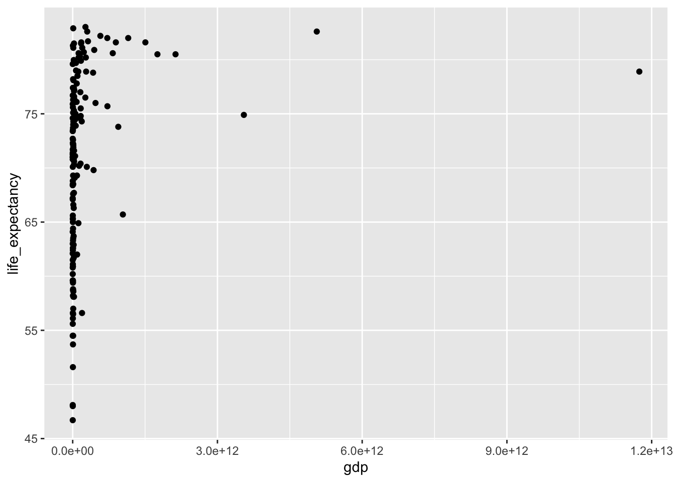
Here’s an example plot:
ggplot(data = gap2011) +
  geom_point(mapping = aes(x = gdp, y = life_expectancy))
## Warning: Removed 17 rows containing missing values (geom_point).
# Can we add more information to this plot?After you’ve done some exploration of life expectancy, move on to add some plots and text under your Fertility header.
Breakout room information
For this exercise, we will create three types of breakout rooms: interactive, quiet, and solitary.
- For interactive rooms, participants are expected to have the camera and microphone on and troubleshoot as a group (although each person will be typing in their own document, you can share screen etc to work together).
- For quiet rooms, participants will work on their own, but can come up with questions for the group to discuss.
- For solitary rooms, participants are not expected to interact with each other at all, and will completely work on their own.
You will be able to choose your own rooms, but let’s limit the group size to 4, so pick a different room if one already has this many participants.
Recap (10 minutes)
Share your findings, challenges, and questions with the class.
Short break (10 minutes)
Exercise 2: Publish your data visualizations on a website and explore different website styling options
General instructions
For this exercise, you will build a GitHub Pages website as described in Lecture 5 and display our gapminder data visualization result on this website. For this website, you will each build your own, so there is no need to invite a collaborator. Just make sure your repo is public to be able to build the site.
Suggested activities
You can split your RMarkdown file into separate files, so each section (i.e. data, life expectancy, fertility, infant mortality) becomes a separate page and can get it own tab. You can e.g. split your content into files named
about.Rmd,life_expectancy.Rmd,fertility.Rmd, andinfant_mortality.Rmd, and the add those as tabs in a_site.ymlfile, as described in the lecture notesYou can then consider adding a table of contents and changing the styling (theme) of your website, as described here
Remember that it may take a little while for your website to update after you have pushed your changes to GitHub, but you can always check the current build (after running rmarkdown::render_site()) in your Viewer pane in RStudio.
END LAB 3
